Friday 17 October 2014

Final


There are some minor details to finish, like the shield badges on some characters and the zombie should have an orange shield. A few more lighting layers/ metals shines and adding more - or taking away all - ground shadows. The background tone and the shadow value destroys some of the silhouettes instead of helping to define them, especially the dragon. I was hoping the Zombie face would pop more too.

 I think the arrangement of the hero's poses could be spaced out differently for more clarity.

There is some problems with the layer arrangements too which became very confusing with so many separate shapes.
I learned too late in the process that grouping and working with isolated selections makes life much more simple. I also learned too late that instead of creating each shape separately and retracing neighbouring shape edges over and over there are ways to simplify the process it using pathfinder options. However I find that method less free flowing as you have to think it through earlier rather than pushing and pulling lines until they feel right. That preplanning kills some of the enjoyment.

I'm not sure how successful the Final character is, I feel he works better in the context of the range of beers and corresponding characters, each with traits that follow their name.  I don't feel this character inherently speaks "Beer" to an audience - too much context required perhaps.
I think the name 'Epic' is better served than the product 'beer'.

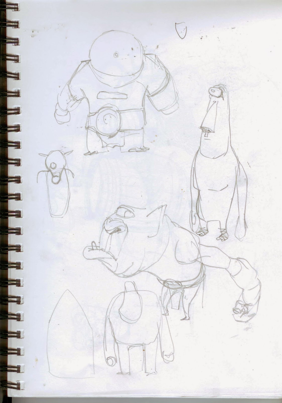
I know that if I could just get to the final sooner, instead of researching for weeks and drawing rough scribbles over countless pages, then these issues could be refined as I go, with time to correct all the minor problems like the list above. I do not know how to get started earlier and bypass all the work that ultimately ends up unseen and especially unused.

Thursday 16 October 2014

The rest of the gang

Pale ale, Stout, Larger, Hop Zombie, Mayhem, Armageddon
I didn't draw these fellows beyond the initial sketch but rather just made them up as i drew with the pen tool. I wish I'd just done that from the beginning as all the prep sketches didn't tell me anything about what it would look like made out of angular vectors. Unfortunately I don't have any process of these characters or colours as I just did them as I went. The mayhem character above proved tricky to get a chrome look working straight into illustrator so I painted this up quickly in PS to try and understand the level of light stylization I wanted.

More knight design and refinement


It's rare that I like anything I draw but the guy on the bottom left has some interesting lines

Is it more amusing to go for proud or delusional?

Assorted action poses for the final character


Drawing the same damn pose over and over

It definitely started working better with a change to low angle

I don't know how to upload pics in an ordered fashion so these are early designs


Final poses before Illustrator.

Reference


A knight character lends itself more to irreverence and humour - major components of the current Epic branding. The knight can show heroism and nobility while also suggesting pomposity, false bravado and delusion.
Looking for beer related shapes and motifs to help with silhouettes and thematic ideas


I landed on a bottle opener as a subtle beer reference that could integrate with armour well.


A possible Greek soldier character for the "Zythos" edition beer 

The Arthurian legend seems appropriate and I like the idea of the lady of the lake offering a bottle.

Playing with the bottle shape as the overall silhouette but it was too restrictive

This drawing captures the feel of the absurdist, Don Quixote-like inversion of "Epic" that I was gravitating towards 


Knights were big beer drinkers which helped solidify the concept.

I like the idea of "too far" poses. A suggestion of over-compensation or bravado. 


This sketch was trying an angular low poly style which looks much better when completed in vector. I think pencils are meant to flow.

Helm studies from reference.

Studies for helm statuette or sword hilt motif. Not sure what the horned slug is about.

Action poses


Rough (rough rough) possible page layout.

Trying to understand the shoulder armour mechanism. Scrabble scores irrelevant


I found it difficult to figure out how shoulder armour would accommodate extremes like arms above shoulder line.

Abandoned round table notion

A bottle cap "halo" just seemed to evoke legend.